Fuel Flow — Trustable AI pricing across 420 fuel stations
Under NDA and unable to be named publicly, the client is a national fuel retailer in the Netherlands, pricing 420 stations every day off the back of spreadsheets and email. Fuel Flow, an AI-assisted pricing tool, serves as a navigable map of the entire portfolio where every station lives as an urgency-coloured dot and every AI suggestion arrives with a written reason and a confidence score. As UX Lead — a freelance consultant brought in through In Time Tec — I was instrumental in shaping the design from first user contact through to an approved proof of concept, on the ground with the client while the engineering team built from India. My role covered research, interaction design, and the front-end prototype. Key responsibilities included the discovery and synthesis of user research through a diary study, semi-structured interviews, journey-map workshops, and a MoSCoW prioritisation with the pricing manager, the interaction design of the navigable map, the pricing dial with live margin feedback, and the AI-review and bulk-confirm paths, the design of trust mechanics such as written justifications, confidence scoring, and hierarchical guardrails, the application of the client-selected IBM Carbon design system, and the construction of an interactive coded prototype in Claude Code that the front-end engineer extended into the production build.
The Situation
When I started I knew nothing about what a pricing manager actually does, so the first thing I did was listen and identify the optimal research methods to deploy. The goal was to understand PACT (people, activities, context, & technologies) more deeply so that I could design a solution that truly solved the problem.
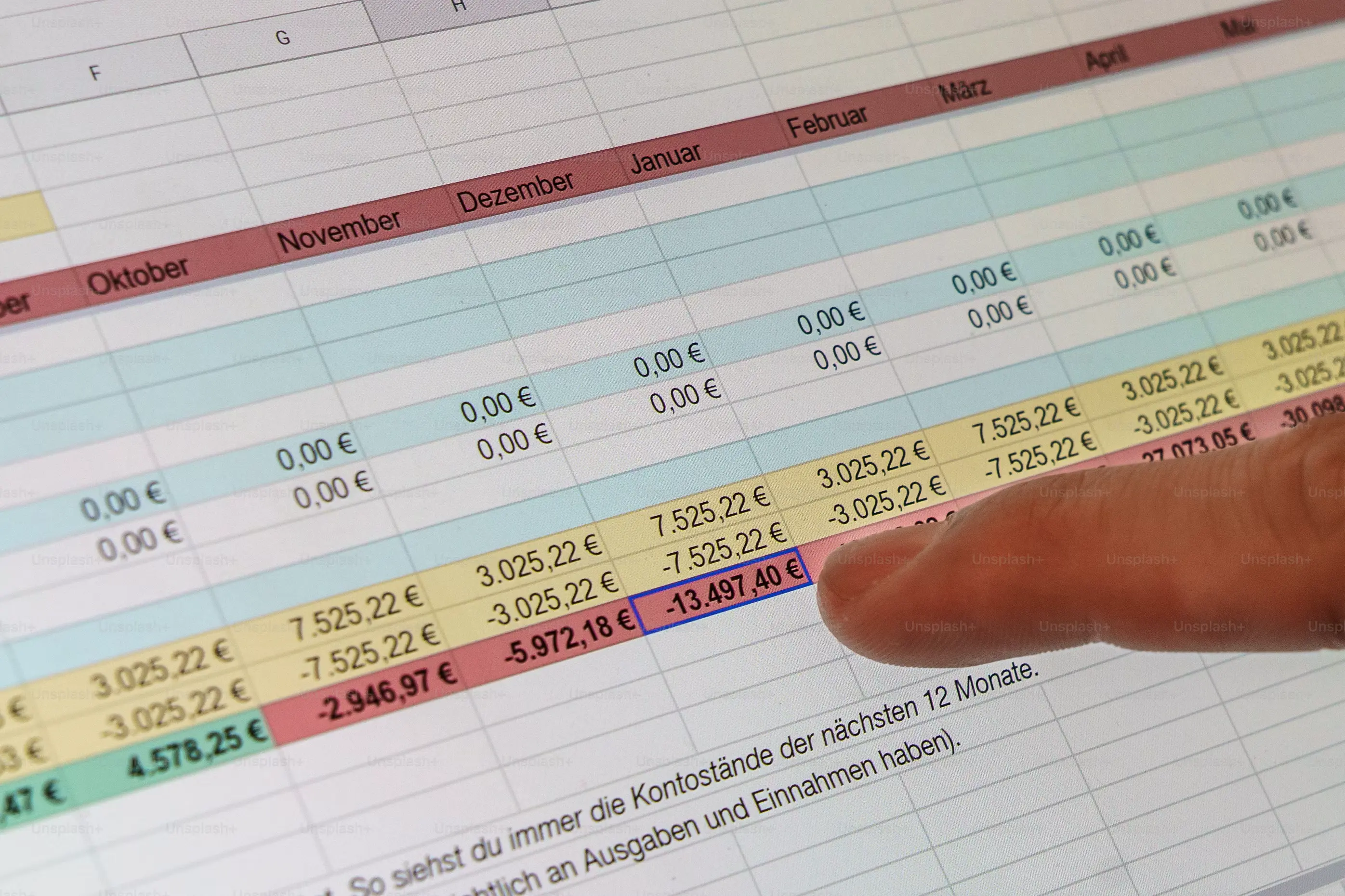
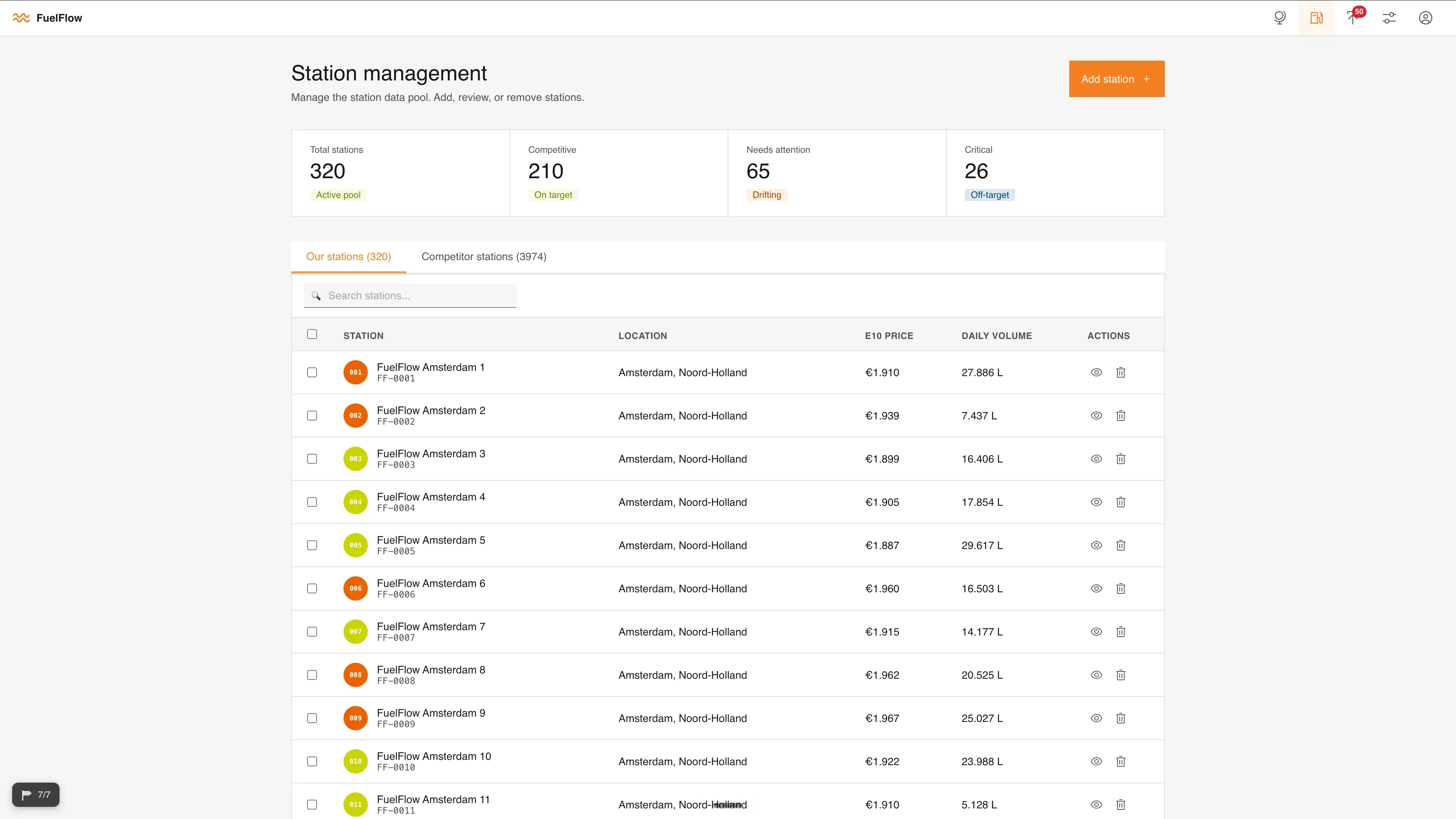
Every morning they analysed a spread of data — competitor pricing, yesterday's prices, and how each station had sold. They'd work out a price, type it into a sheet, and email it on to the next person to be set. It was easy to get wrong, and slow: with 420 stations to clear, a lot of them were still sitting unreviewed hours later. No AI, no overview — setting prices for the entire portfolio relied on one person.
This work is high-stakes. Set the price too high and you lose customers to the station across the road; too low and you give away margin. It shapes the brand perception, how competitive you are, and the company's profit — every single day. The existing setup simply couldn't support the manager in getting across every station, so the brief took shape: create a tool that gives pricing managers a clear overview of the entire portfolio, let them price each station individually, quickly, and in a way that optimised for selling volume.
Discovery & Research
I approached this project with a design thinking methodology based on a double diamond process. Understanding our users' problems starts with the empathise stage — fortunately I had direct access to the end user.
After an initial group meeting I had a high-level picture, but I needed the step-by-step process of the pricing manager's day. It became clear to me that a diary entry would provide a record of what actually happens, in order, without me in the room influencing it.
To get a deeper understanding, I ran an hour-long interview with a set of semi-structured questions. Where the diary gave me the chronology, the interview let me dig — ask follow-ups, navigate the problem together, and surface key findings that matter most, for example: Fuel pricing decisions are highly manual, experience-driven, and cognitively demanding. Our pricing manager said “A lot of it is just experience, you kind of know what works for which station.” and “Every day you're looking at buy price, list price, margin, competitor prices… and then you decide what to do per station.” It became clear there was a strong opportunity for a new system to reduce mental overhead and standardise decision quality.
Following this initial research, I created a research document to share with the rest of the team where I synthesised all key findings, the design implications, user empathy map, user story, pain points, the user persona, and a draft user journey map.
For me, creating a user journey map requires putting two and two together: inferring the emotion and the reasoning behind each step. I won't presume to know someone's experience, so I verify it before I design against it. I took this draft user journey map to the pricing manager in a one-on-one workshop to validate it step by step. In this case the map held up, with only small adjustments. This validation allowed us to move forward with confidence that we understood the desired user flow.
At this stage we had a wide sense of what was possible to support the pricing manager's need, so to put order to the range of possibilities we did a feature-prioritisation (MoSCoW) exercise with the user on Figjam. This gave our user time to consider each possible feature, score them in terms of importance, and rank them in positions 1st–5th. Later, I cross-referenced the result with the senior pricing lead — and apart from him nudging one item up, we were aligned. That agreement confirmed we were on the right path and let me focus on the right things first.
By this point I understood the people, the technology, the activities, and the context. The pains worth designing against came down to a few things:
Uneven market
Market changes are frequent but uneven — not every station needs the same attention, and there was no fast way to see which ones did.
No big picture
The day-to-day ate all the time, so portfolio-wide visibility was shallow and patterns got spotted too late.
Fragile workflow
The workflow itself was fragile — Excel was error-prone, approval and execution were split apart, and cut-off times drove everything.
The Design
With the research synthesised and the pain points agreed, we ran an ideation session as a team. The business analyst had been ruminating on this concept for a while and carried their own vision. Putting that alongside the research I'd brought back is where the final concept came from.
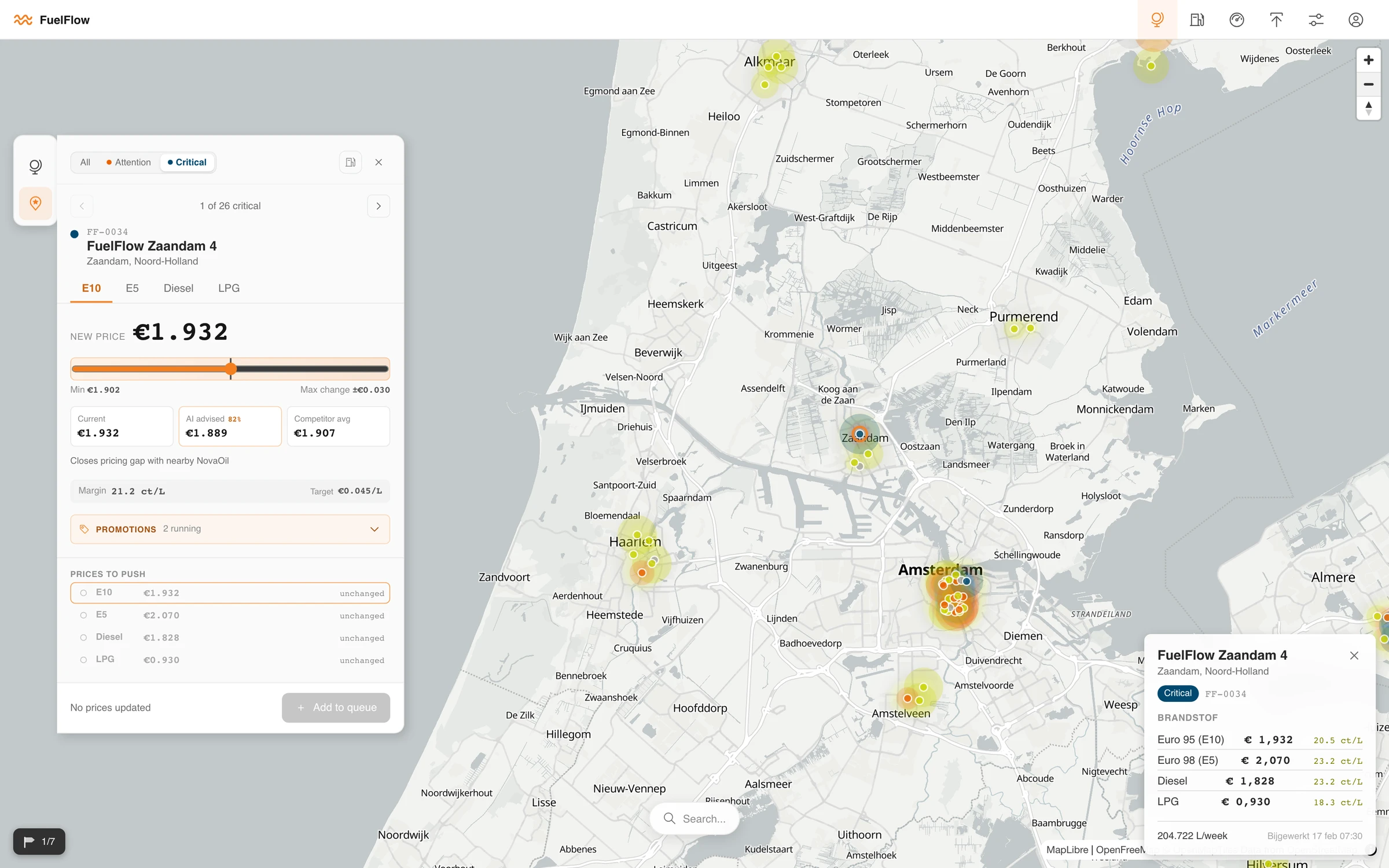
The default direction was a conventional dashboard — a flat, 2D view of the stations and their data. It would have done the job, but the manager's real problem was never reading the numbers; it was knowing where to look first across 420 stations, and a flat list treats every station the same. The concept that changed everything was a navigable map. The moment it was on the table I was gripped: you get the whole portfolio in one glance, and the tool can send the manager to the stations that need them first — far more organically than any list.
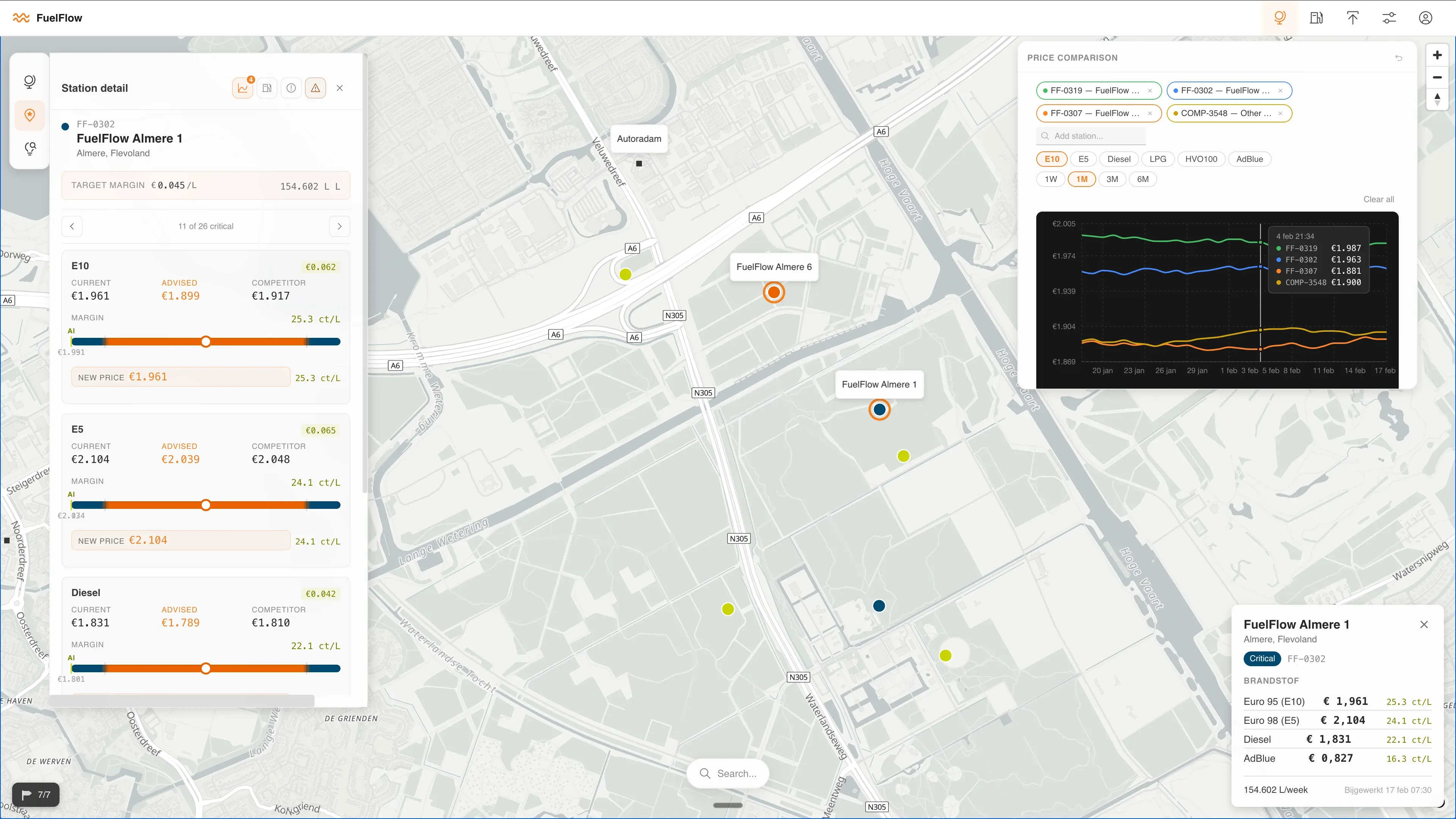
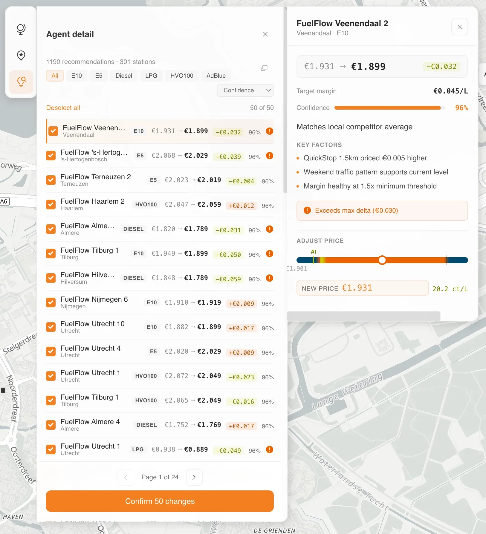
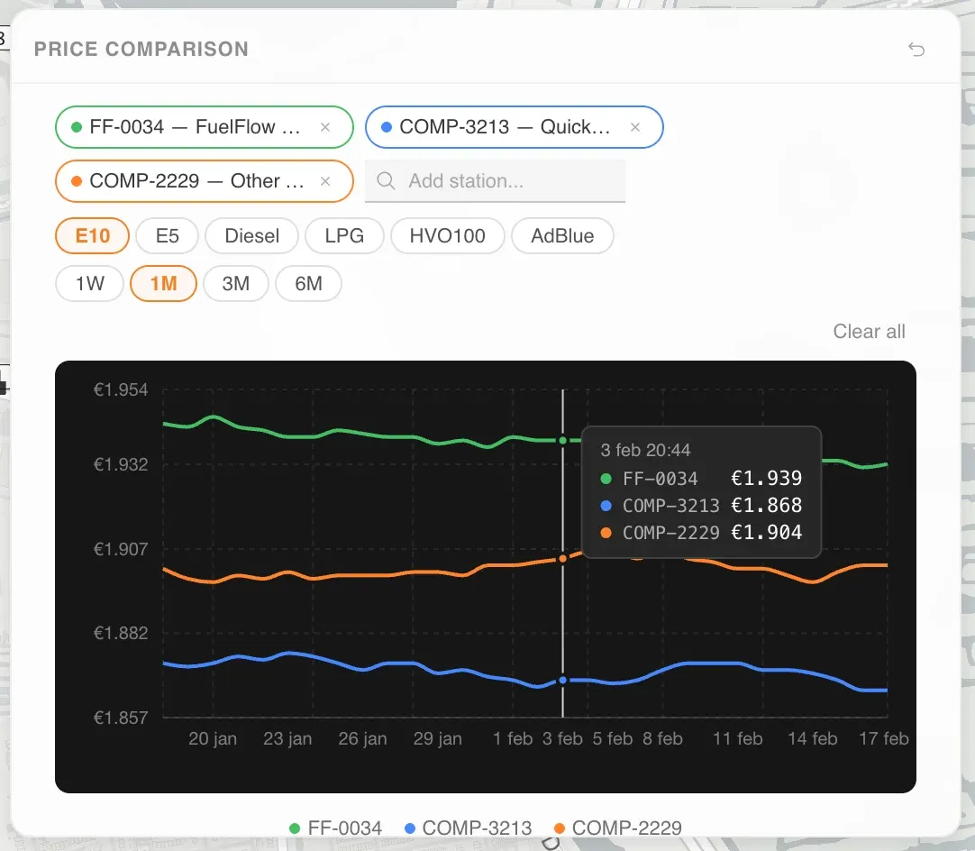
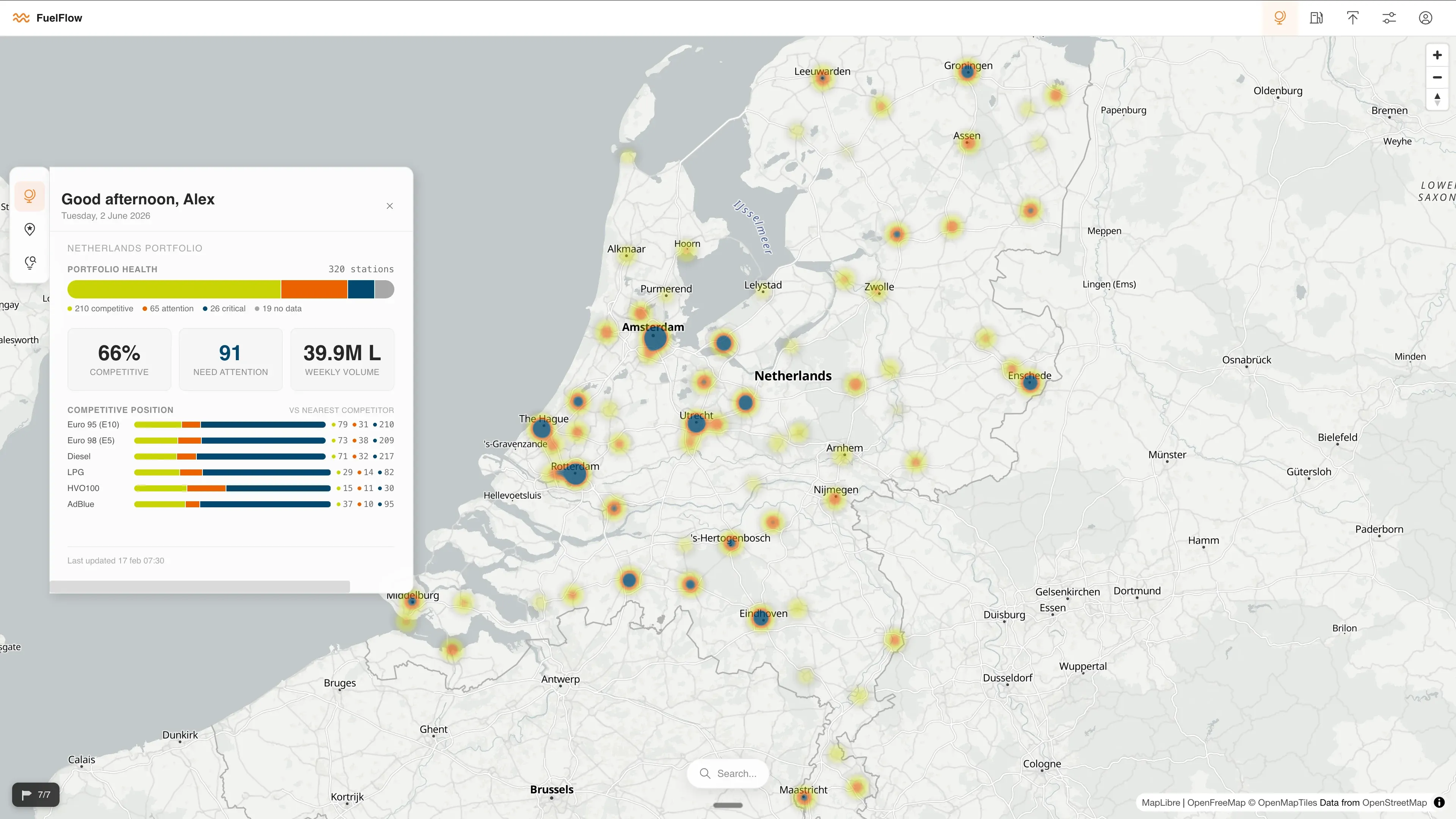
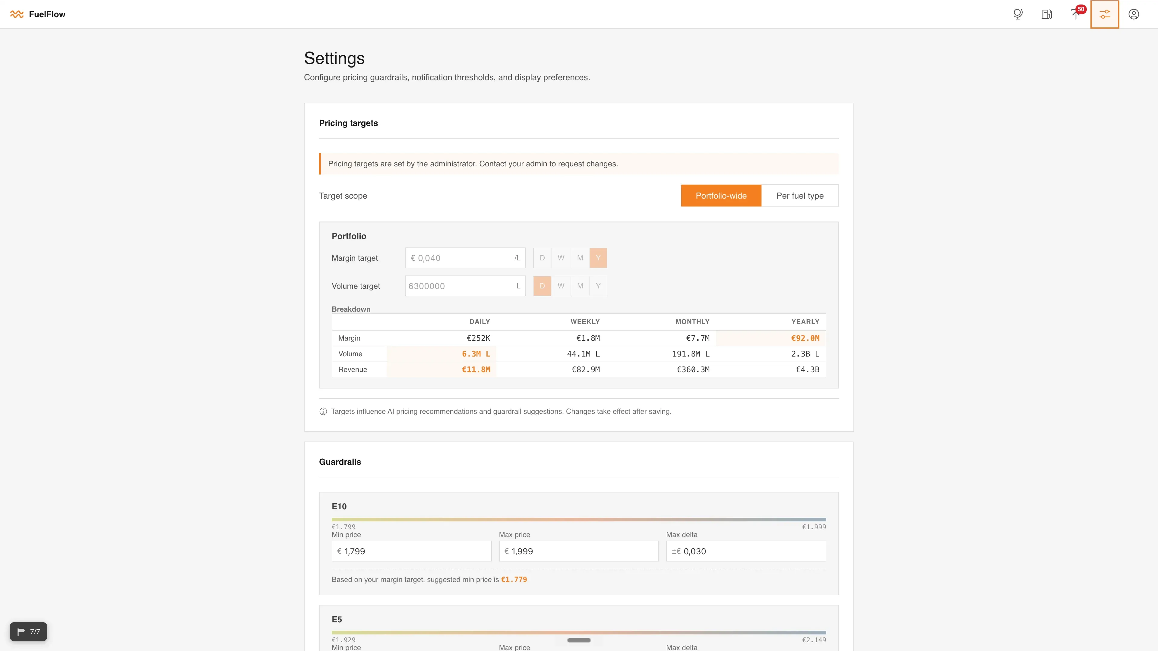
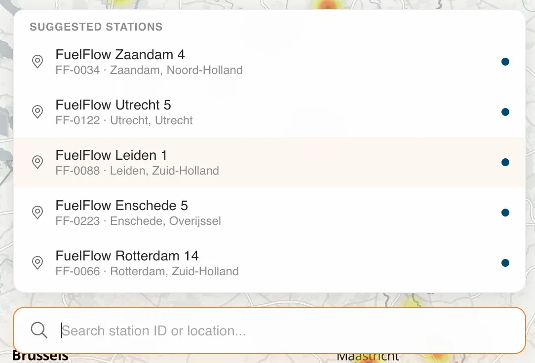
From there the solution took shape as a navigable canvas — a map of the Netherlands with each station as a colour-coded dot for urgency, and movable widgets floating on top so the manager lays the screen out however suits them. A control-panel widget on the left carries three tabs that mirror the manager's day: an overview of the whole portfolio, a way to filter by urgency and work station-by-station, and an AI review with bulk upload. Select a station and a detail card opens where you set the price — you pull a dial and watch the AI's suggested price and the live effect on your margin as you move it, or enter the value by hand. A graph widget lets you compare stations side by side against competitors; engineering wanted to push it to a separate page for performance, but the user had been clear they needed it on the main view, so I pushed to keep it on the canvas and the team made it work within scope. The bulk path ends in a deliberate second review — the one place I wanted to slow things down — so nothing goes out unconfirmed.
Getting the model accurate was the hard part, but accuracy only pays off if the manager trusts it enough to act fast — second-guess every suggestion and you lose all the speed. So every suggested price carries a written justification and a confidence score out of 100, the human always commits the price, and the guardrails sit in a hierarchy: the senior lead sets them, the manager sees them read-only, and they're fed to the model up front so suggestions arrive already inside the agreed range. (One small but telling change: I'd started with a green/amber/red traffic light; the manager asked for a colour-blind-friendly palette, so we moved to one — and it happened to line up with the brand.)
Then the design itself. Before any of it I'd built the design system — I shortlisted three and handed the choice to the client's team, who picked IBM Carbon, so the whole thing took shape in a style they owned. From there, instead of Figma, I gave Claude Code full context on the project and orchestrated several instances of it in parallel to bring the concept from the ideation session to life as a real, interactive, coded prototype. That's my design process now: communicating using natural language with engineering agents, interacting with the prototype, and iterating on it directly rather than wiring static frames together to fake interactivity. What would have taken me 120-plus hours in Figma I had a first draft of in about five — something real to get feedback on the next day.
And that's exactly what happened. I presented it to the client and got high-quality, specific feedback — putting competitors on the map, among others. Because the prototype was live code, I took those notes straight back to my agents and implemented the changes in the same fast turnaround. From there it kept iterating gradually: one-on-one sessions with the manager, discussions in the team's Scrum meetings with engineering, each pass tightening the design against real use.
Coding in real code meant the build naturally grew past what the proof of concept needed, so the last move was to bring it back to the scope the client had paid for. I'd built the prototype so features could be switched off down to a POC core and back on to reintroduce the full vision — one continuous experience spanning both. The front-end developer did most of the reducing; I collaborated on bringing it back. Sharing through GitHub instead of a Figma hand-off freed them to spend their time on the back end — wiring up the APIs — rather than rebuilding my prototype from a static picture. The honest risk is that I hand over code I'm not always across, and there's a chance of some rework, but weighed against the time it saved, it was worth it.
The Outcome
In a feedback session I ran a usability test and we scored 85% — a high level of satisfaction, with refinements since. The proof of concept has been approved, and the client is now investing in turning it into an enterprise-grade product to price all of their stations — a result that comes down to the whole team: the model the engineering team built, and a design built around it that the client could trust.
In plain terms: the software replaced the spreadsheets and gave the manager a real overview of which stations need them first. They can now get across all 420 in about an hour, where it used to take the better part of a week — covering more stations, more often, with the manager in the loop the whole way, is what lets them stay competitive and sell more volume.
My Role & the Team
I came onto this as a freelance UX consultant brought in through In Time Tec, working as the team's UX lead. I was the point of contact on the ground in the Netherlands — in direct contact with the customer of In Time Tec — while the engineering team worked from India. We met daily in Scrum, where I'd bring the research and design back to the table and we'd plan the work together.
My part was the research and the design: understanding the pricing manager, working out what we actually had to build, and crafting it into a coded prototype. The engineering team's part was the model — and that model is what makes the whole thing work. It's a serious piece of engineering, and they did a great job of it.
This was a genuinely combined effort, and the result reflects both parts: a design the client could see and trust, sitting on top of a model accurate enough to back it. My prototype ran on a realistic dataset across all 420 stations that I had AI synthesise — location, pricing, suggestions, margins — so it felt like the real endpoint without ever exposing client data, and would later be populated with the engineering team's live predictions. That the design is now being grown into an enterprise product is, more than anything, down to the strength of the model the engineering team built.

What I Learned
The biggest thing I took from this was learning to design in natural language and craft code at the same time — running Claude Code instances inside Visual Studio Code, so designing and building became one motion rather than two. Along the way I picked up the rest of the pipeline too: sharing the work through GitHub and deploying on Vercel.
The change that stuck most was in the quality of feedback. When the prototype is this high-fidelity and genuinely interactive, the user and the client can react to something they can actually use — and that feedback is far easier and faster to implement than notes against a static design.
It's worth being honest that designers generating code is still new, and this workflow isn't optimised yet. Making the most of what these AI models can do — while designers and engineers keep working together — is going to take communication, time, and effort from both sides to craft the right way of working. That's exactly what makes it an exciting place to be moving forward.